
Bhutail, Sreekail-3544, Muradnagar, Cumilla.


In the modern content economy, podcasts have become one of the fastest-growing formats on YouTube. From business discussions to personal storytelling, podcast videos compete in an extremely crowded visual environment. This YouTube Thumbnail Design Portfolio Project was developed to showcase advanced thumbnail design strategies specifically tailored for long-form podcast content.
Unlike short-form or entertainment videos, podcast thumbnails face a unique challenge: they must represent long conversations, multiple speakers, and deep topics using a single static image. The objective of this project was to create visually compelling, professional, and consistent thumbnails that elevate podcast branding while maximizing click-through rates.
This portfolio project highlights a long-term, scalable approach to youtube Thumbnail Design, where consistency, clarity, and brand recognition play a critical role. The thumbnails were designed to help podcasts stand out in search results, suggested feeds, and playlists, ensuring viewers instantly recognize the content and feel encouraged to click.
Each thumbnail was treated as a strategic marketing asset rather than a decorative image. Design decisions were made based on viewer psychology, YouTube viewing behavior, and visual storytelling principles. The project demonstrates how strong thumbnail systems can support podcast growth over months, not just individual uploads.
This case study reflects the ability to manage large-scale thumbnail production while maintaining quality, creativity, and performance—an essential requirement for professional YouTube podcast channels.
Designing thumbnails for podcast content introduces a distinct set of challenges that differ significantly from regular YouTube videos. This project required solving complex design problems while maintaining long-term consistency.
1. Representing Long Conversations in One Frame
Podcast episodes often cover multiple topics in a single video. The challenge was to visually summarize the core idea without confusing the audience or oversimplifying the content.
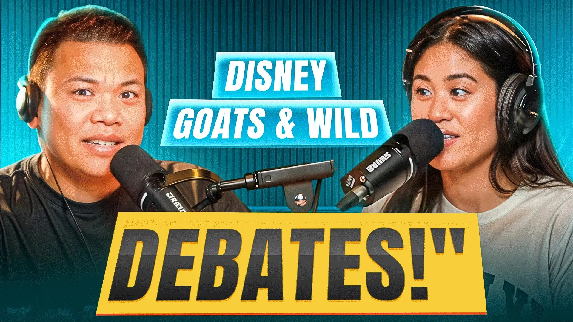
2. Multiple Faces and Visual Balance
Many podcast thumbnails include two or more speakers. Balancing multiple faces while keeping the design clean, readable, and emotionally engaging was a major constraint.
3. Consistency Over a Long Timeline
Podcast channels publish regularly over months or even years. The challenge was to design thumbnails that look fresh while maintaining a recognizable visual identity across a large volume of uploads.
4. Avoiding Visual Fatigue
Using similar layouts repeatedly can make thumbnails feel repetitive. The project required subtle variations in composition, color, and emphasis without breaking brand consistency.
5. Professional Tone vs. Click Appeal
Podcast audiences expect credibility and depth. Thumbnails had to attract clicks without appearing sensational or misleading, especially for serious discussion-based content.
To overcome these challenges, a systematic and performance-focused design framework was applied throughout the project. The solution emphasized structure, repeatability, and strategic creativity.
Content-Centric Concept Planning
Each thumbnail concept began with identifying the episode’s core discussion point. Instead of highlighting everything, the design focused on one strong idea that best represented the episode’s value.
Clear Speaker Hierarchy
When multiple hosts or guests were present, visual hierarchy was established using size, placement, and contrast. This helped guide viewers’ attention naturally without overwhelming the frame.
Strong Typography System
A consistent typography system was developed to ensure readability and brand recognition. Short, impactful phrases were used to reinforce the episode’s theme without overcrowding the design.
Color Consistency with Controlled Variation
A defined color palette was used to maintain brand identity. Controlled variations in background, lighting, and accent colors helped keep the thumbnails visually interesting across many episodes.
Emotion and Authority Balance
Facial expressions and visual cues were selected carefully to convey curiosity, confidence, or seriousness—depending on the topic—without drifting into exaggerated or clickbait-style visuals.
Mobile-First Layout Strategy
Given that a large percentage of YouTube viewers watch on mobile, thumbnails were optimized for small-screen visibility. Key elements were positioned safely to avoid cropping and loss of clarity.
Scalable Workflow for Large Volumes
The project followed a structured workflow that allowed efficient production of high-quality thumbnails over an extended period. This ensured consistency without sacrificing creativity or attention to detail.
The final outcome was a cohesive library of podcast thumbnails that strengthened channel branding, improved viewer recognition, and supported sustainable YouTube growth through strategic youtube Thumbnail Design.
Podcast videos are often longer and topic-heavy. A strong thumbnail helps summarize the value of the discussion quickly, encouraging viewers to click despite longer durations.
Podcast thumbnails focus more on credibility, clarity, and branding rather than shock value. The design emphasizes conversation themes, speaker presence, and professional aesthetics.
Yes. Consistency builds recognition and trust. Viewers are more likely to click when they instantly recognize a familiar and reliable thumbnail style.
By maintaining a core design system while varying composition, expressions, and emphasis points, thumbnails stay fresh without losing brand identity.
The process is structured, scalable, and strategy-driven. It supports high-volume production while maintaining quality, clarity, and performance across months of content.
YouTube Thumbnail Design Portfolio Project – Podcast Edition
YouTube Thumbnail Design
Podcast Creators & YouTube Channels
January 2025
6+ Months
$1000-$2500
Our team will answer all your questions. we ensure a quick response.
Copyright © 2026 IMITBD. All Rights Reserved.
Hello! How can I help you Sir?